DAYTON ART INSTITUTE REBRAND
The Dayton Art Institute, one of the nation’s finest mid-sized art museums, was founded in 1919 as the Dayton Museum of Arts. The founding leaders of the museum include Orville Wright and the Patterson brothers. Around the 1930s, the museum was renamed to the Dayton Art Institute to respond to the growing significance of its school as well as its museum. The main audience of the Dayton Art Institute includes older adults. However, the museum has made a strong push for a more diverse, young audience. They have done this by providing family and youth programs, interactive galleries, classes, and social events.
The Dayton Art Institute, also commonly known as DAI, has struggled to gain an audience of teens and children with its traditional and formal branding. Therefore, the challenge of this project was to design a flexible brand to better engage all age groups, as well as, creatively differentiate their various offerings.
Brand GUIDEBOOK


BRAND GUIDELINES MAin Museum
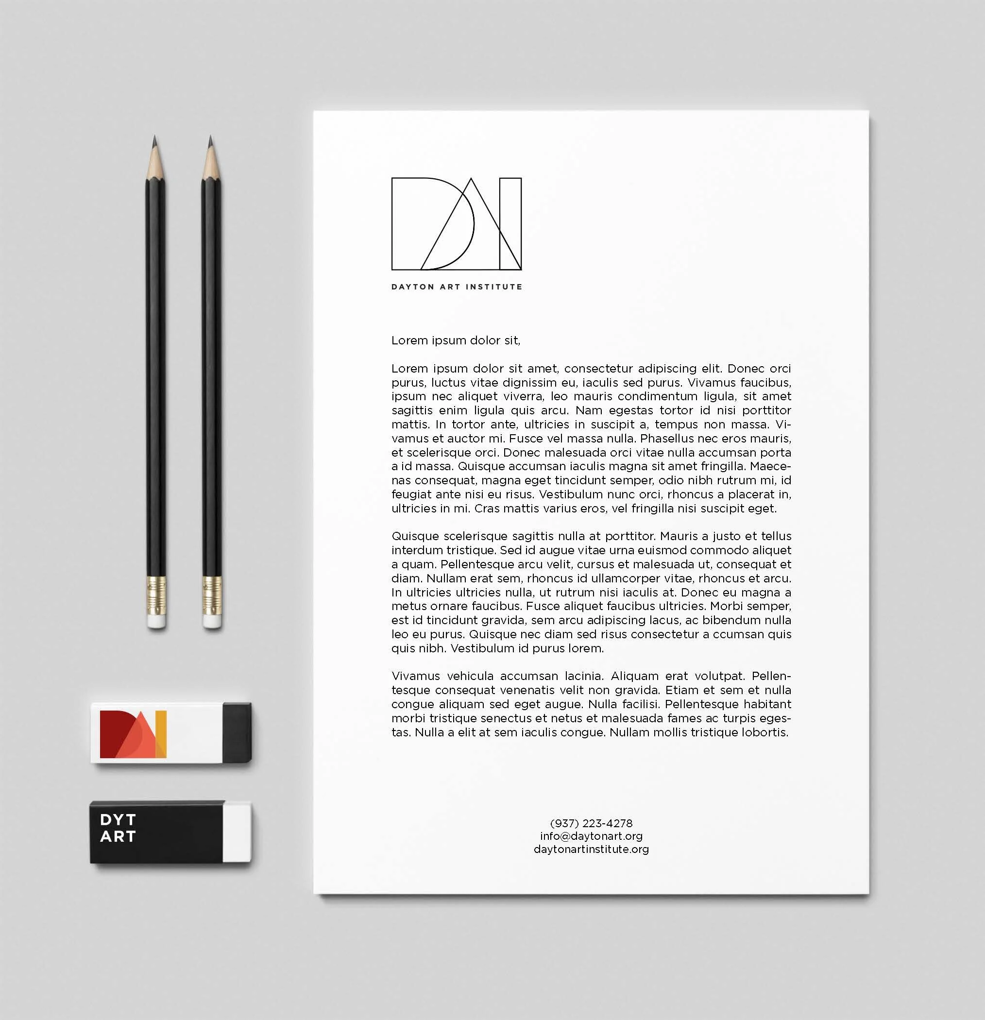
The largest section of the museum that focuses on curating and showcasing artwork must always use the deep red, bright orange, and gray color palette. These colors are sophisticated and attract a diverse audience of different ages. In fact, the red is seen as a powerful, exciting, and energetic color. As a result, it is highly visible and can capture attention quickly. The vibrant orange is then used to compliment and meld with the red. Orange has been known to be a color that represents joy and creativity, something that The Dayton Art Institute strives to promote. To ground the bold colors, shades of gray were utilized within the monogram for the main museum.

Brand Guidelines Education Program
Within the museum, the DAI prides itself in its outstanding education program. The museum offers classes, fellowship programs, and educator resources. Through all of the offerings, the goal of the education department is to develop visual literacy, an understanding of art’s place in history, and appreciation for its ability to transcend various cultures, and its impact on our lives.
To showcase this important sector of the museum, a separate, fun color palette was created. The majority of those that participate in the education program are children and young adults. Therefore, bold, bright colors were used to capture their imagination. While the red and the orange remain the same, yellow replaces the gray. Yellow is a color of curiosity. Hence, the Dayton Art Institute always pushes students to constantly analyze their surroundings. In a world with no definitive answers, the more curious you are, the more solutions you reveal.

DELIVERABLES
Through the utilization of brand guidelines, printed pieces, signage, apparel, accessories, and educational items were created.