DuQUESNE ATHLETICS
Within athletics, it is crucial to have a brand that is divergent, powerful and eye catching to separate it from competitors, aid in recruitment, and spark a fire within fans. Duquesne University’s existing logo was continuously mistaken for the Detroit Tigers. Therefore, Duquesne Athletics tackled a comprehensive identity redesign for its seventeen athletic programs to attract the next wave of Duquesne University athletes.
The identity system is still in the transition process, but the current response has been extremely positive. Engagement rates after the launch have sky rocketed to 600%, 500%, and 100% on Facebook, Twitter, and Instagram respectively. ChangeUp, an environmental design company I interned for in 2019, received two gold honors from Transform Awards for Best Brand Evolution and Best Identity in Education. The team has also competed in a nearly undefeated season since the implementation of the brand.
This video was developed by ChangeUp, an environmental design firm that I interned for within the year of 2019. The video uniquely displays the key elements of the brand. I am so fortunate to have collaborated and learned from extremely talented designers on this project.
Photo taken by Sydney Bauer.
Icon set
To guide people throughout the stadium, an icon set that coincided with the fierce brand needed to be developed. The creation of the icons was spearheaded by another intern and me. With the guidance of the Associate Design Director, James Bacon, and the Executive Creative Director, Ryan Brazelton, we were able to formulate a set of icons. These icons fit the visual language of the new brand by utilizing specific angles, curves, and graphic elements that were incorporated in the monogram, wordmark, and graphic lion.
Multiple iterations of the icons were made before completing the final set.
North Arena Corridor
The north arena corridor is a main walkway within the stadium. Large glass windows on the opposite wall make it viewable to the street. I was put in charge of ideating different options for the corridor. I designed banners and wall graphics with both preexisting and new elements to create visual interest in the space. I also utilized and placed the newly developed icons to direct people throughout the stadium. This area did not have specified materials or paint colors, so I had creative freedom to explore many different options.
Chuck Cooper Memorial
Charles “Chuck” Cooper was a former Duquesne All-American and National Basketball Association trailblazer in 1947-1950. He lead his team to a 78-19 record and two National Invitation Tournament appearances. In 1950, Cooper was the first African American drafted by a NBA team. During is career, he also played for the Milwaukee Hawks and Fort Wayne Pistons. His legacy has helped clear a path for African American players to make an impact on the NBA.
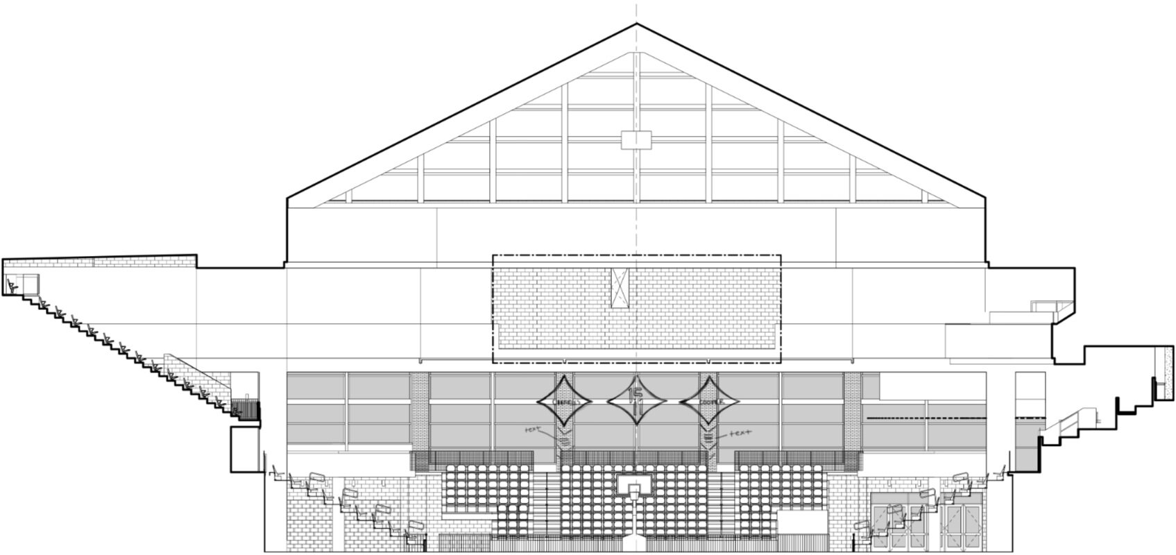
For this project, I was asked to analyze articles about Chuck Cooper that were provided by Duquesne University and to create a memorial that highlights his achievements. I was also given the opportunity to digitally build the sports hall of fame that showcases accomplished Duquesne athletes. To do this, I received elevations from architects. I, then, figured out the colors and materials that go in each area by following the instruction code. From there, I mocked-up my designs within the space.
PRACTICE ARENA
The Joe and Kathy Guyaux Practice and Player Development Center is where teams come together and practice their sport on a daily basis. This space went through a complete renovation to update it with the new brand. I worked to provide multiple options for the space by applying the brand in different ways and highlighting the donors that made the practice arena possible.
Bold Monogram
This option highlights the bold monogram, places the donor names above “We are Duquesne,” and showcases their NCAA conference banners. It is a simple, yet eye-catching way to bring the brand to life.
Fierce Lion
In this version, athletes who walk into the practice arena would first be greeted by the large lion graphic because it is opposite the entrance. This fierce lion is then balanced by three other simple walls.
Locker Room Graphics
Within each locker room in the stadium, there are four areas for large graphics. I was put in charge of ideating different designs for each. With the guidance of the Associate Design Director, James Bacon, we decided to keep the designs uniform throughout women’s basketball, men’s basketball, and women’s volleyball. They only change slightly to match their respective sports.
The Process
Elevations
One of my jobs was to mock-up elevations that were provided by the architects. Here, I would receive the black and white line art, analyze the instruction code that laid out the colors and materials for the space, and fill in the line art with the respective materials in Adobe Illustrator. This would help give the designers a sense of what the space will look like when it is built. Once I built the space, I was able to place my designs in the stadium.


